Shooting With Intent: Photography Composition
Shooting With Intent: Photography Composition
Shooting With Intent: Photography Composition – I joined a group of photographers about a two years ago. I enjoyed joining this group because they really challenged everyone to become better shooters. The challenge was to not only capture the raw emotion of your subject but to also look for opportunities to have photographic intent. Shooting with intent is something that truly challenges you to see the scene for what it is, and what it can become. Over time, I became a more strategic in my shooting. I truly observed a scene and looked for opportunities to create art. My philosophical look toward photography change. Now, I look at photography as an art expression, and no longer a business or a way to just “document your events”. With every session, event or wedding I try to document in a photo-journalistic way but also utilize some of my favorite compositional rules.
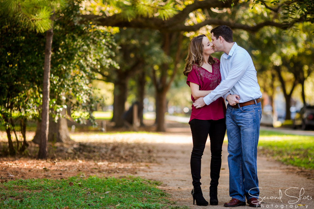
RULES OF THE THIRDS – The first composition rule that I learned and use the most often is Rule of the Thirds. Imagine that your image is divided into 9 equal parts. The rule of the thirds says that you should position the most important element in your scene along these lines, or at a point where they intersect. Some photographers position the subject in the upper, lower, right or left third of the frame to create this look. I find that doing this adds balance and interest to a photo. Some cameras even offer an option to superimpose a rule of thirds grid over your LCD screen, making it easier to use.
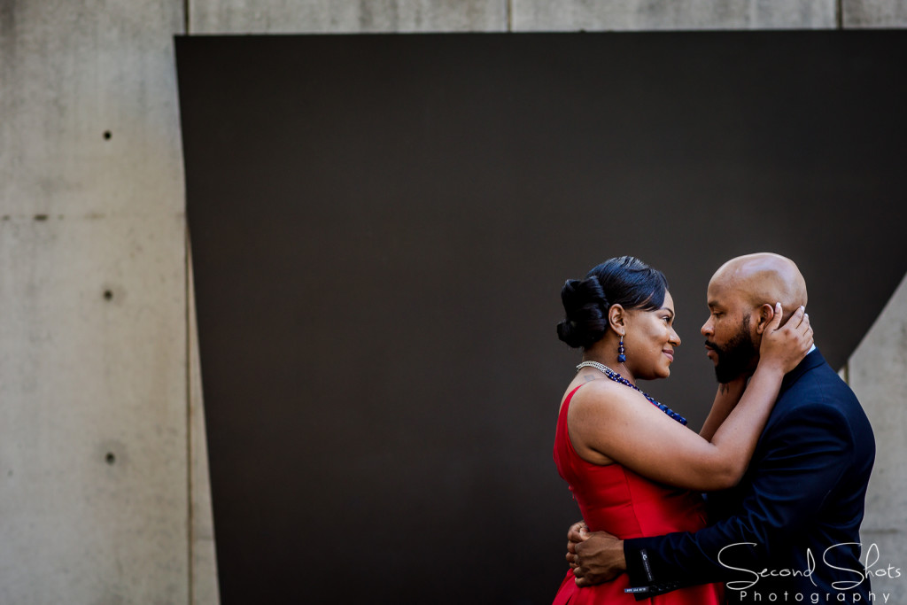
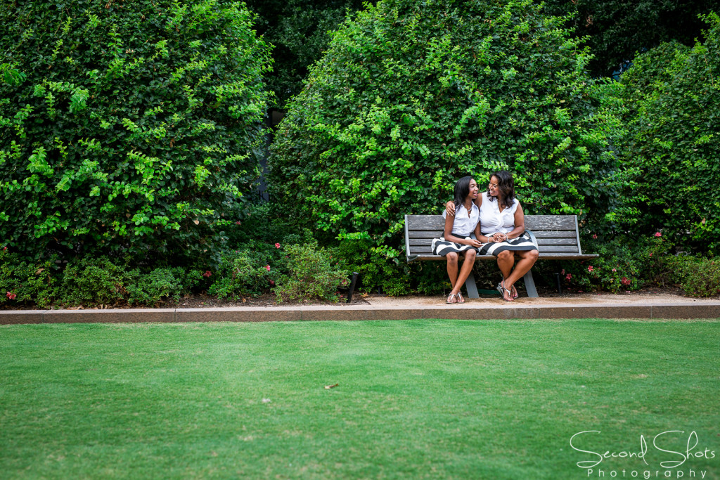
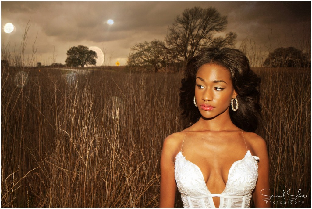
BALANCING ELEMENTS – This is the next progression in the composition rule and is quite similar to rule of the thirds. With Balancing Elements you place your subject off-center, as with the rule of the thirds, but instead of leaving an empty space (often called dead space), you balance the image with an object of lesser importance to fill the space. I find this a great tool to use, especially when you are trying to tell a story.
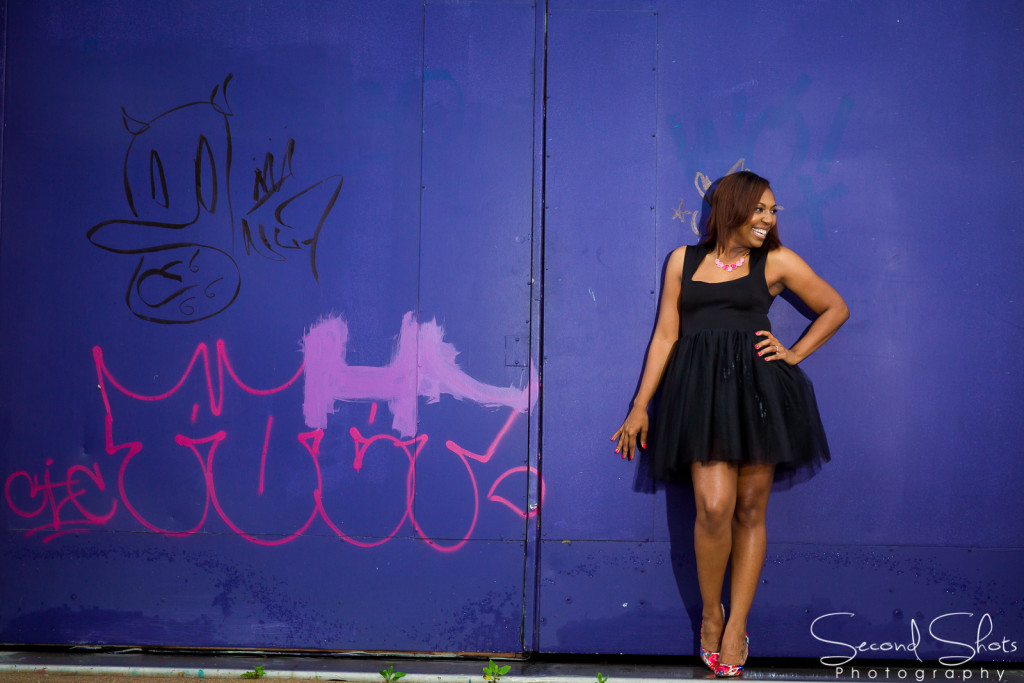
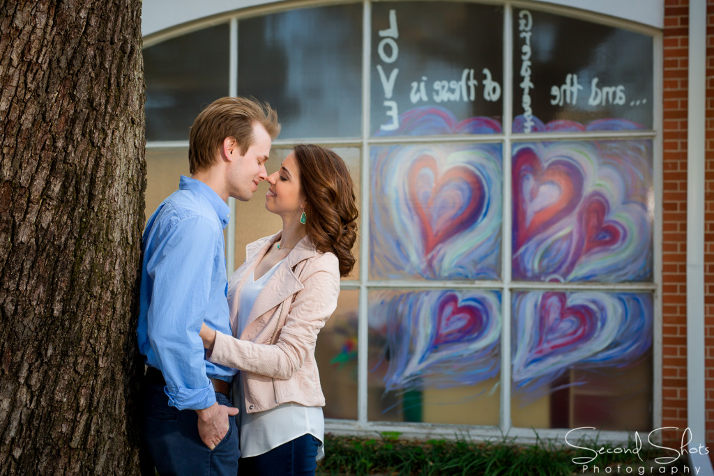


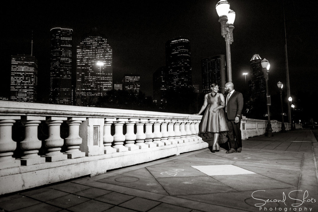
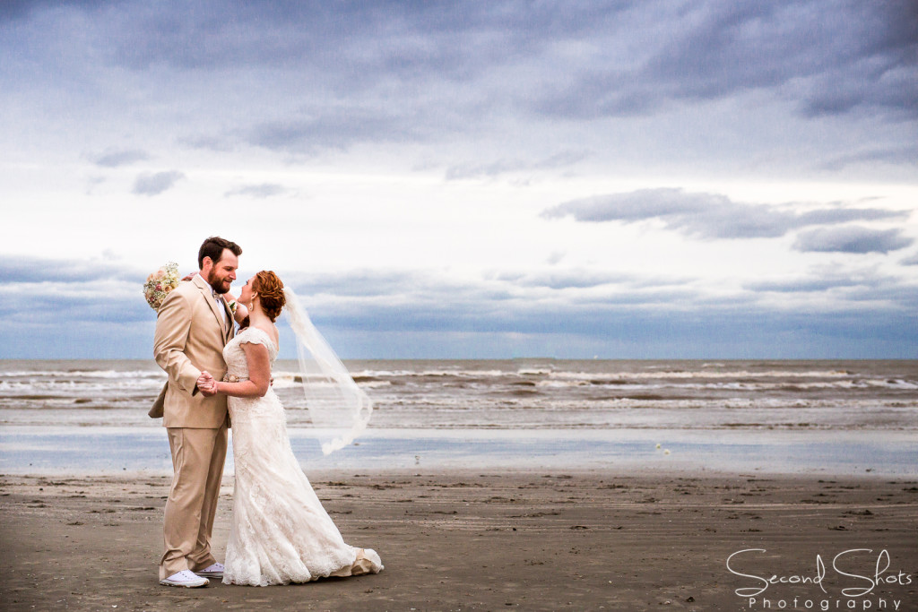
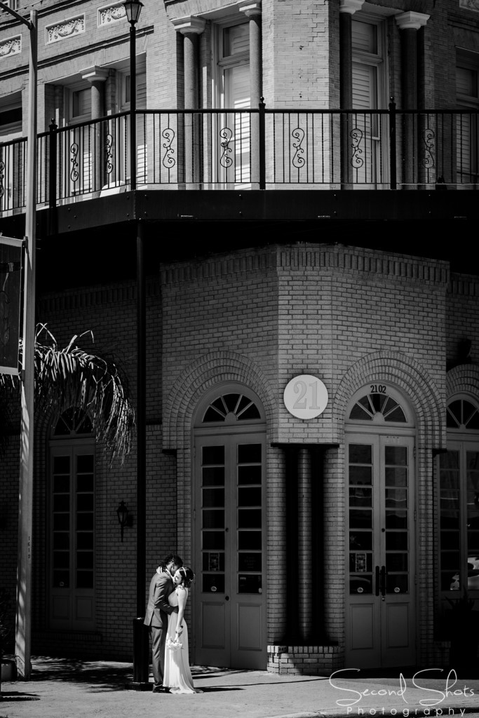
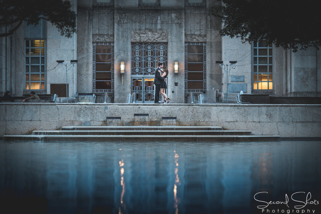
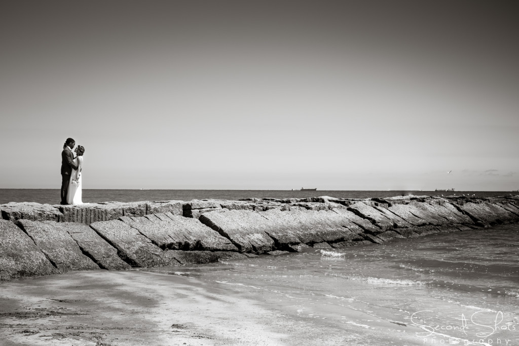
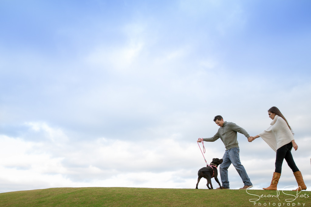
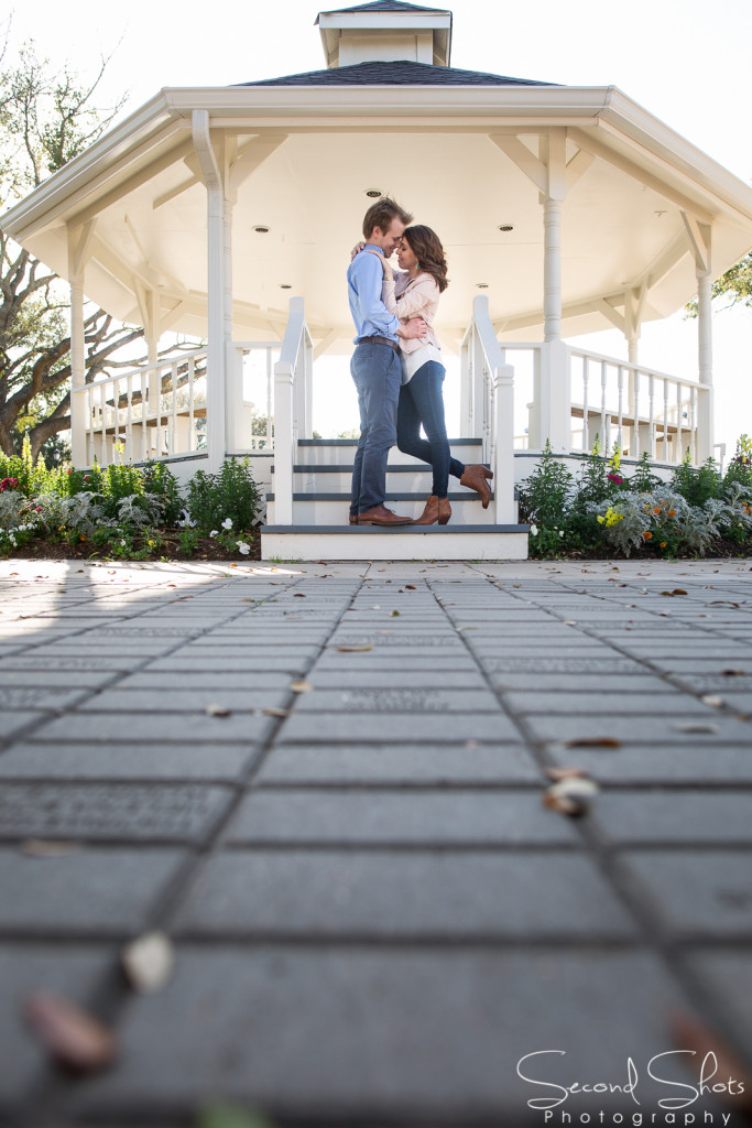
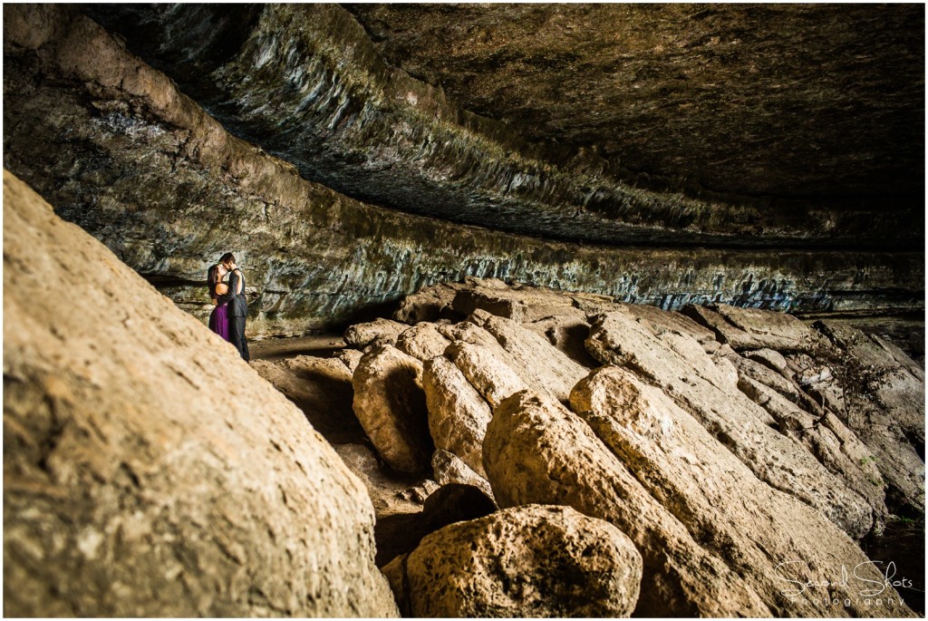
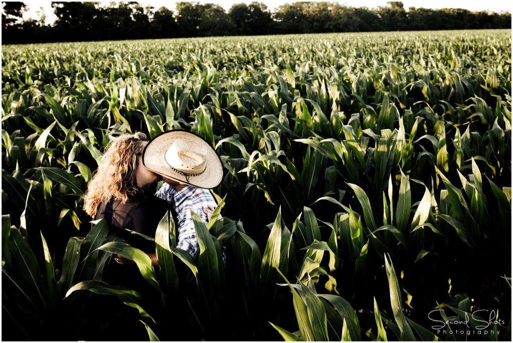
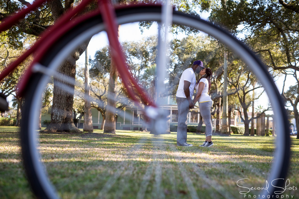
LITTLE PEOPLE – My all-time favorite rule of composition is the little people. I’m not one hundred percent sure this is a true rule of photography composition, but I will make it one for this article. I love to show spatial sense when photographing couples. I find that making the subject really small in a big background is something that truly draws the viewer into the image. Some of my favorite images that I have created, or ones that I enjoy that have been created by others use this technique.
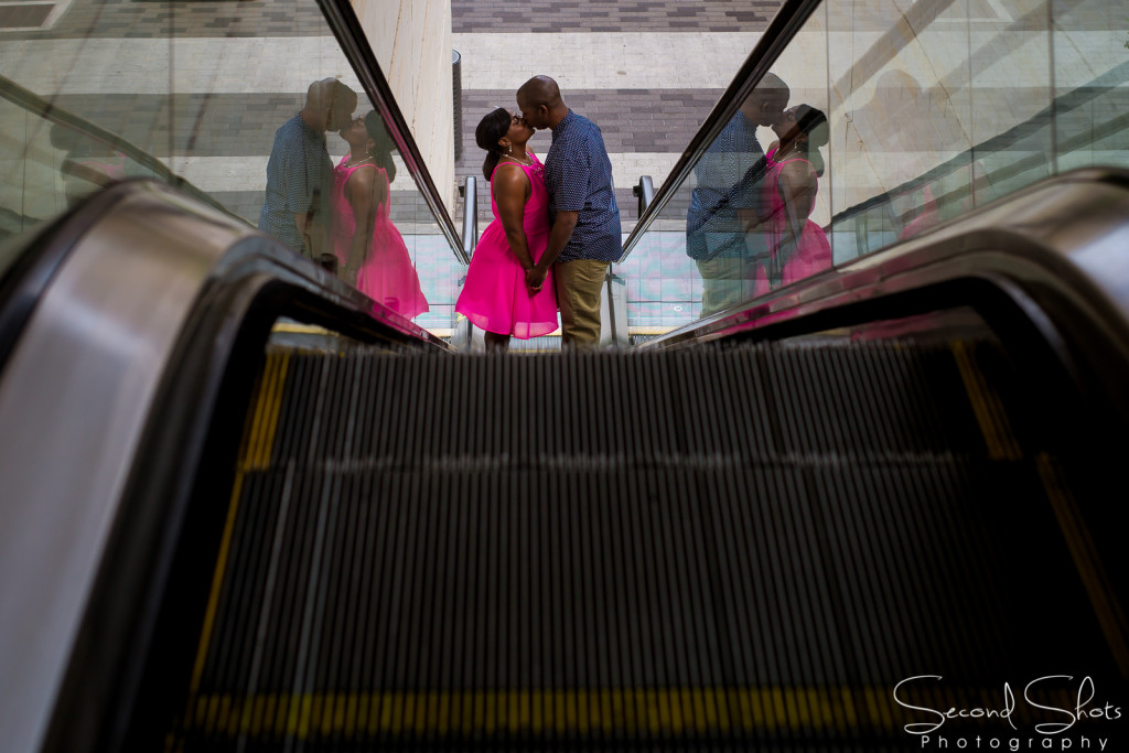
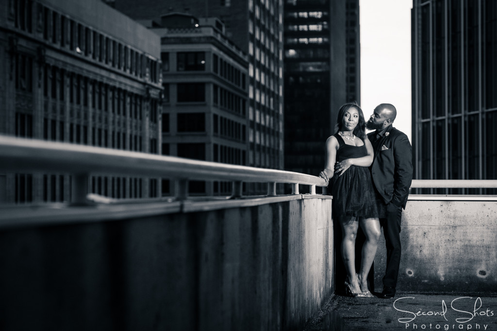
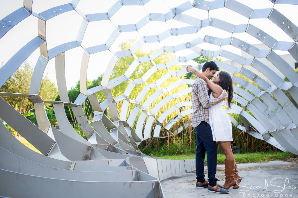
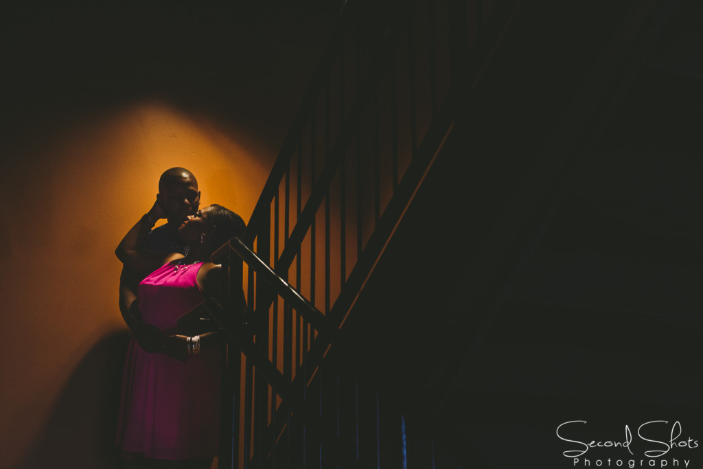
LEADING LINES – Leading Lines is one of the cleverest techniques in photography and easily one of the compositional rules that will make you observe your surroundings. When we look at a photo, our eye is naturally drawn along the lines. By thinking about how you place lines in your composition, you can affect the way the viewer views the image. The leading lines technique has the ability to pull the eyes of the viewer along the images like the eyes read a sentence on this blog from left to right. You can take the viewer on a journey “through” the scene, you can pull them into the picture or your can lead them straight to the subject. There are many different types of lines – straight, diagonal, curvy, zigzag or radial. Each can be used to enhance your photo’s composition.
SYMMETRY AND PATTERNS – In all honesty, this is one of the rules that I should use more often. In my opinion finding the lines of symmetry and patterns that could be both natural and mad-made is a tricky feat. Nonetheless, they can make for very eye-catching compositions, particularly in situations where they are not expected. I love to use the technique of breaking the line of symmetry with the subject or to put the subject directly in the middle of the line of symmetry. This composition is definitely a learning process, but one you will thank yourself for later.
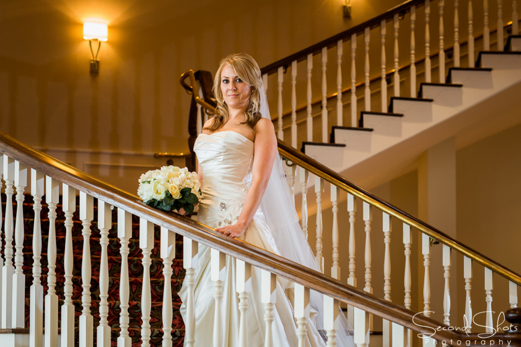
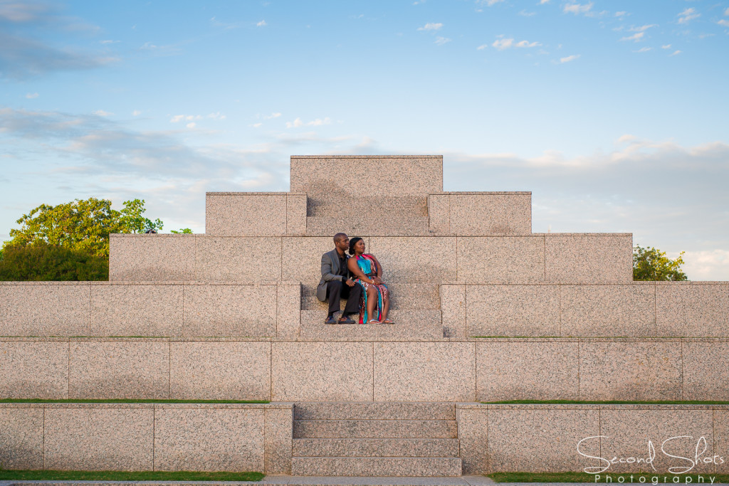
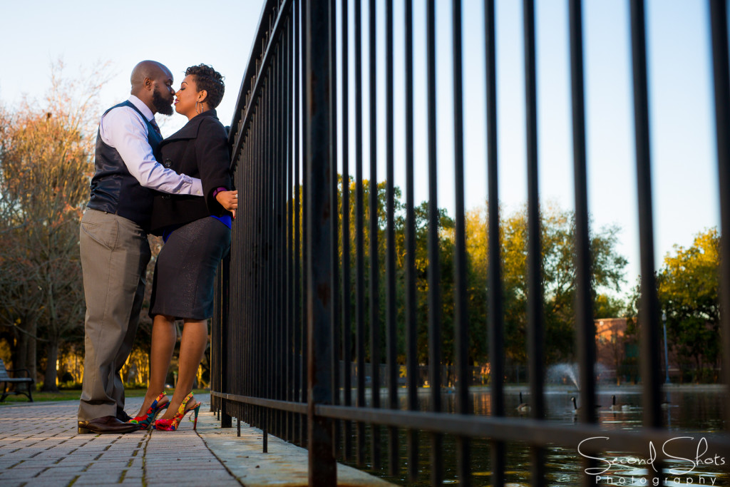
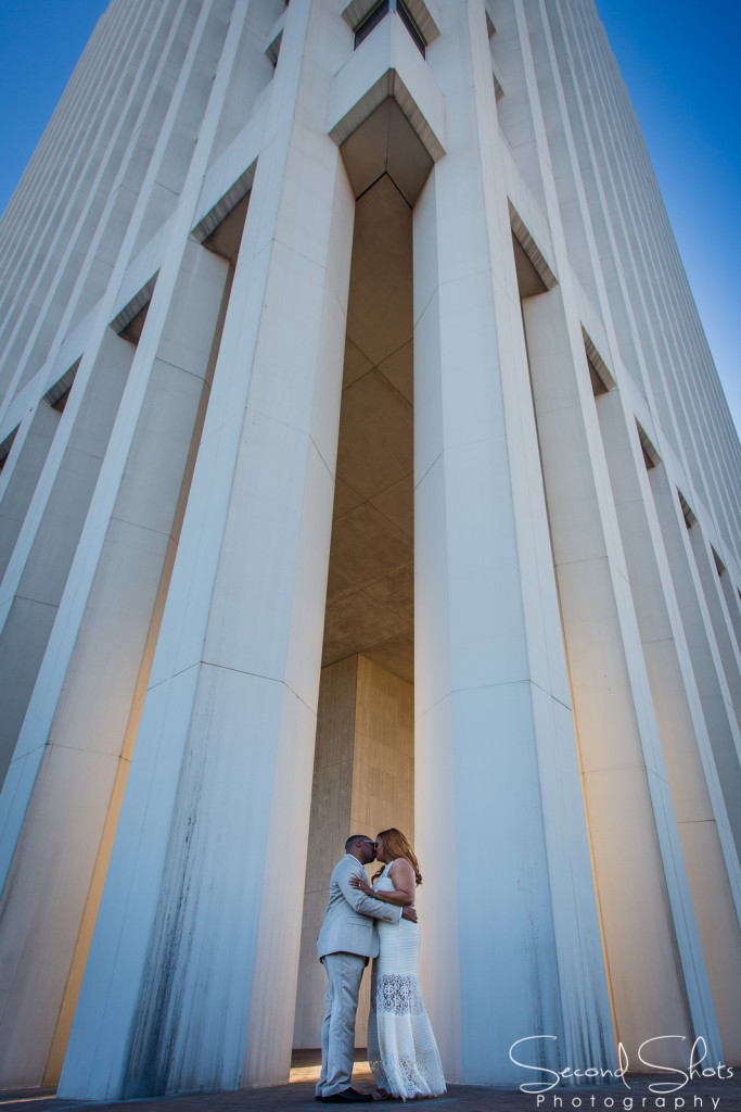
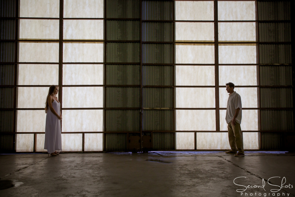
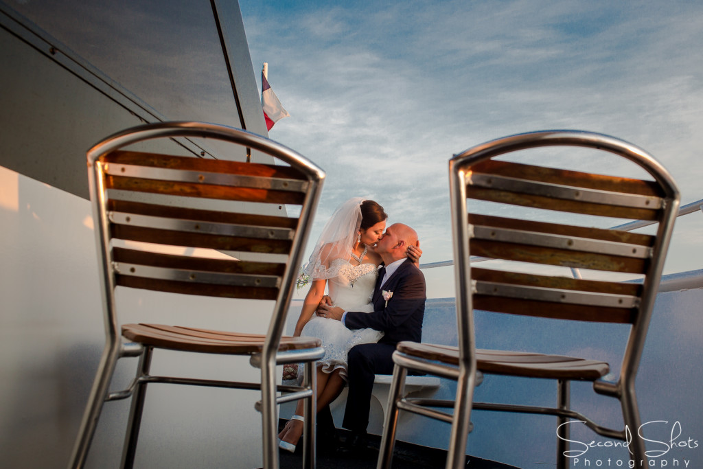
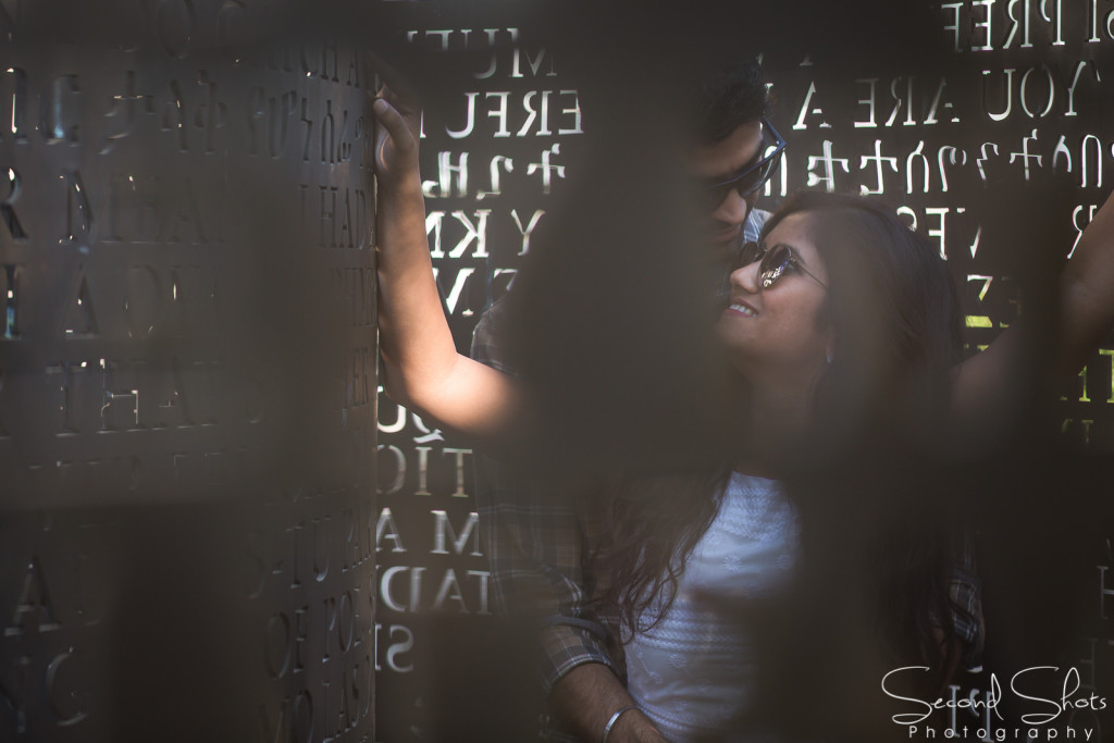
DEPTH– Photography is a two-dimensional medium, but this composition almost makes images look three dimensional. When using this composition carefully it can convey the sense of depth that was present in the actual scene. You can create depth in a photo by including objects in the foreground, middle ground and the background. Another useful extension of this compositional technique is overlapping, where you deliberately partially obscure one object with another. These images work particularly well because the eye recognizes these layers and separates them automatically which gives a two-dimension image more depth.
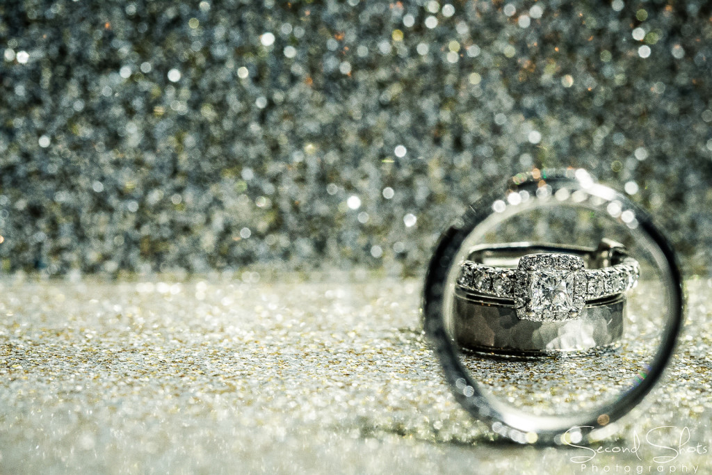
TEXTURES – Textures and Depth are two compositions that need to be grouped right next to one another. Although the photographic composition of using textures is completely different than depth, it shares the characteristics of being able to add a dimension to an image. Finding a contrasting texture or something that is rich with texture can truly turn a two-dimension photo into something that the viewer feels as though they can touch. I would say that I use this rule of composition the least, but it is good enough that when used correctly it can add serious punch to an image.

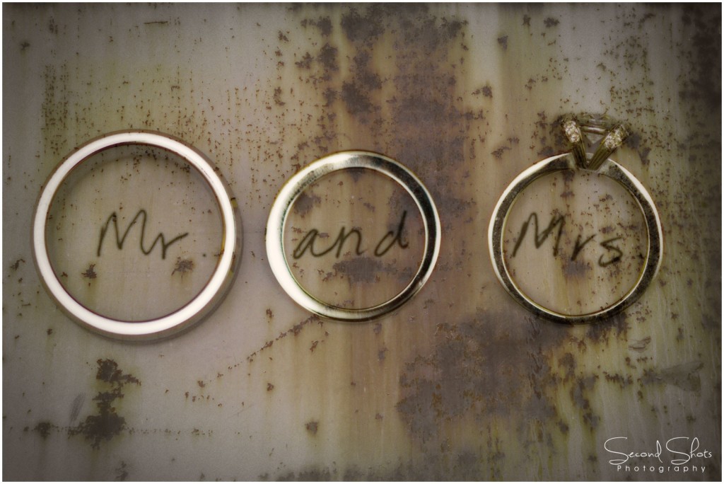
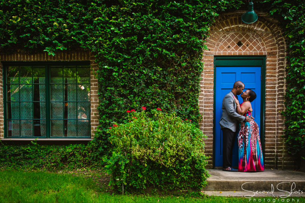
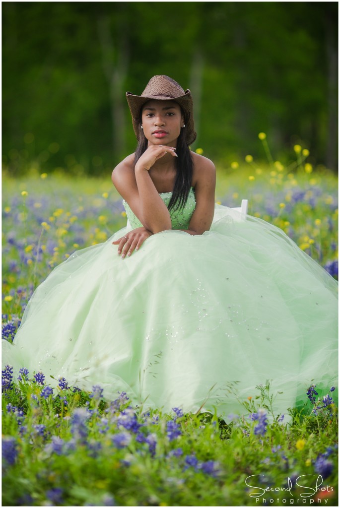
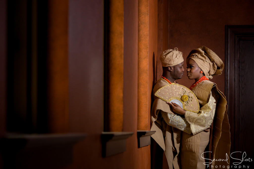


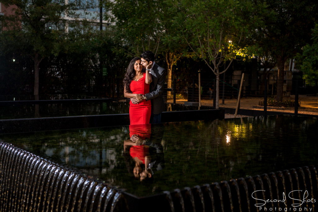
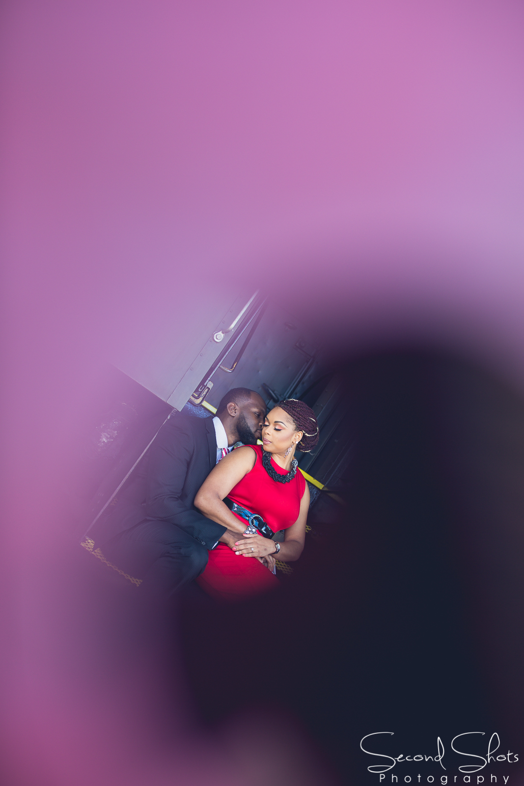
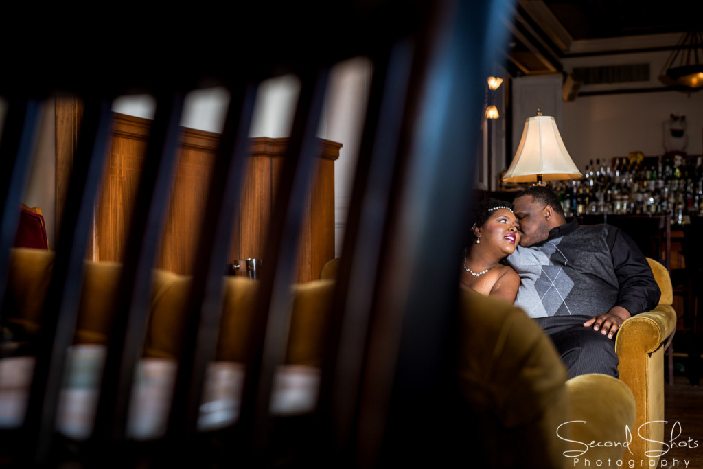
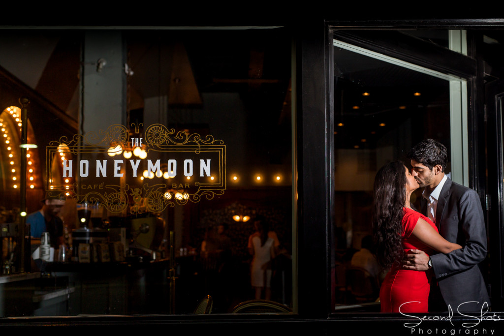
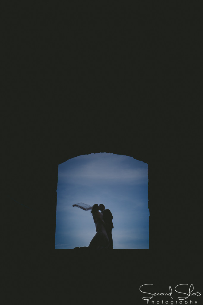
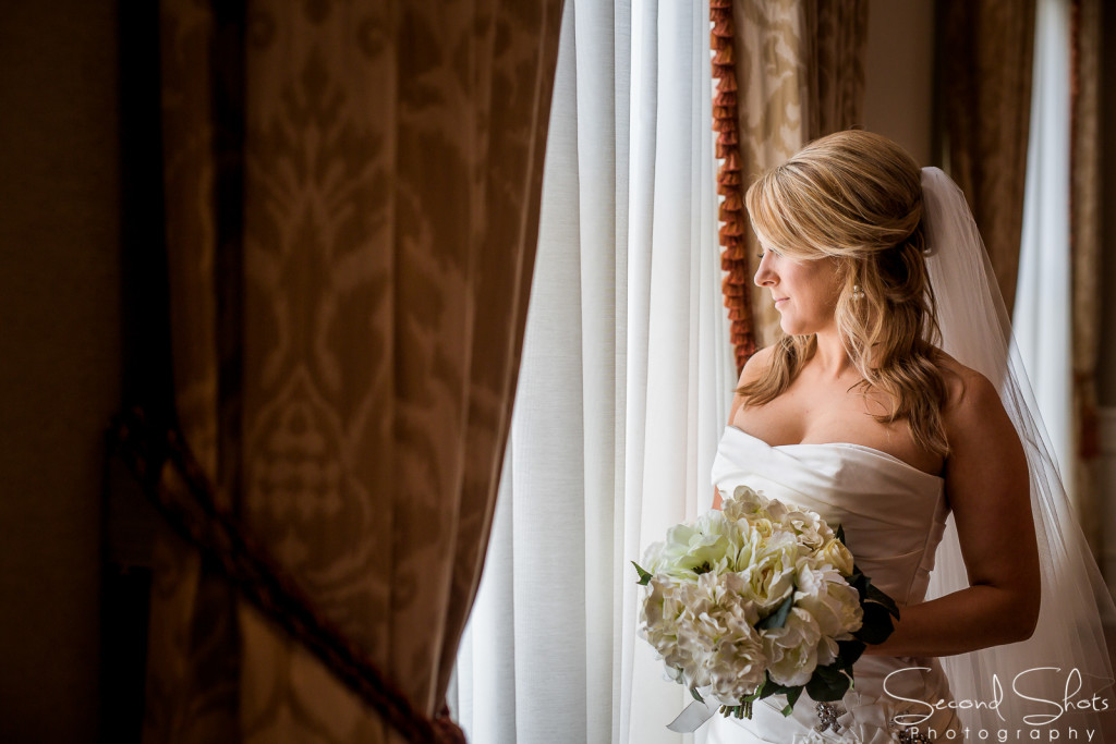
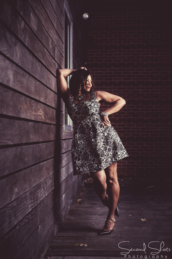
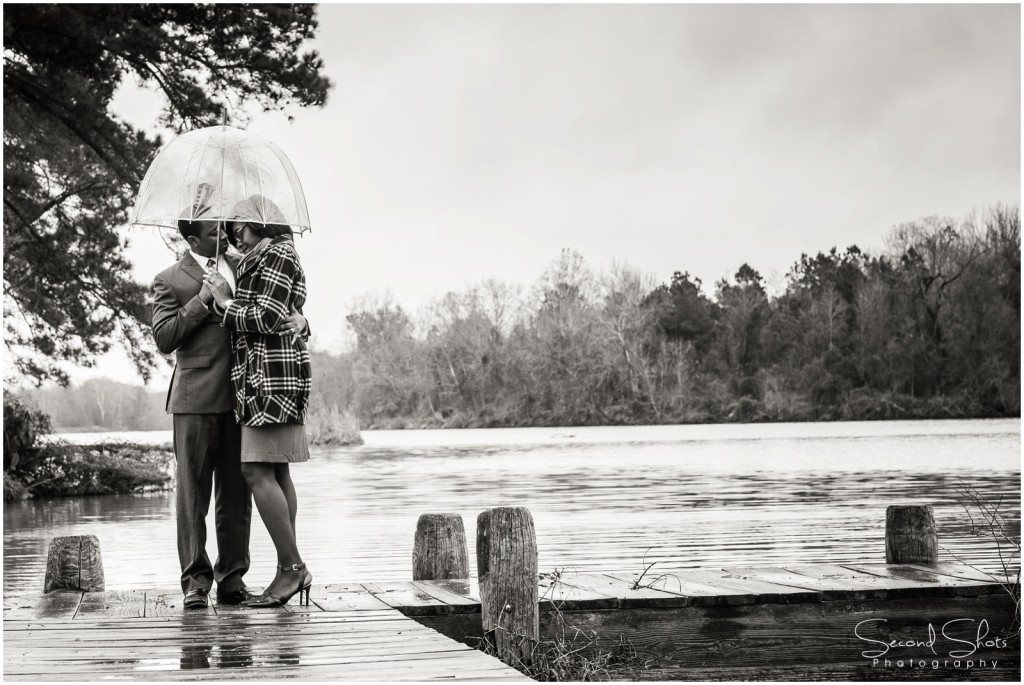
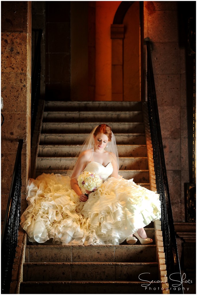
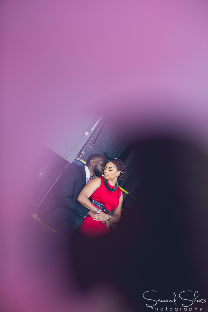
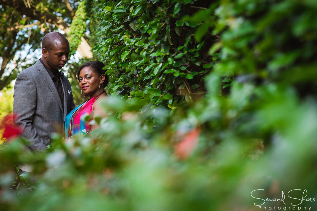
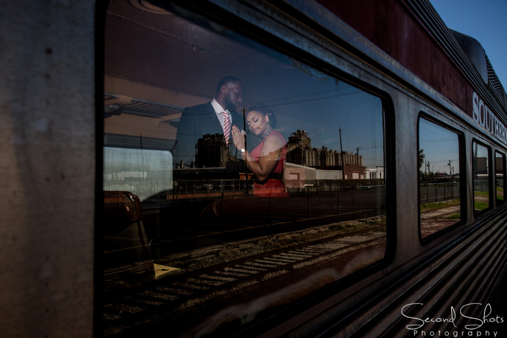
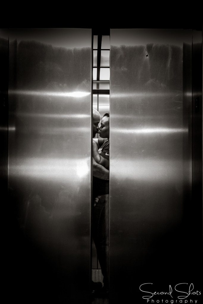
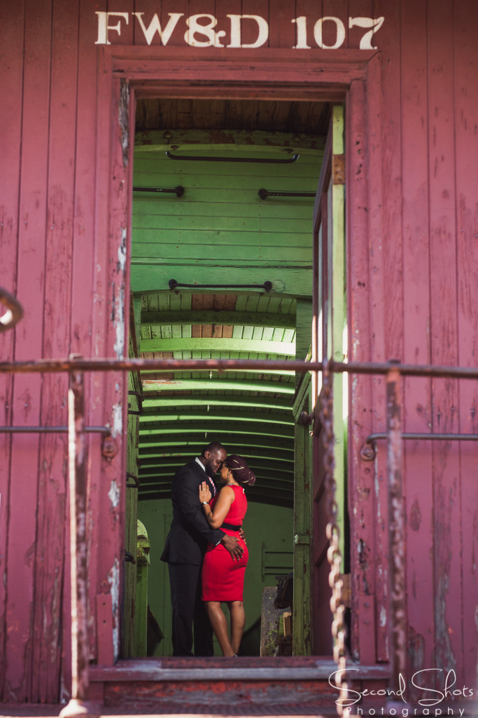
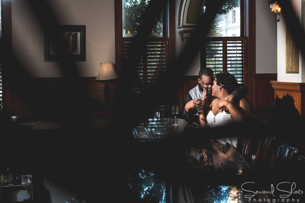
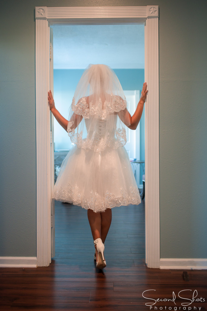
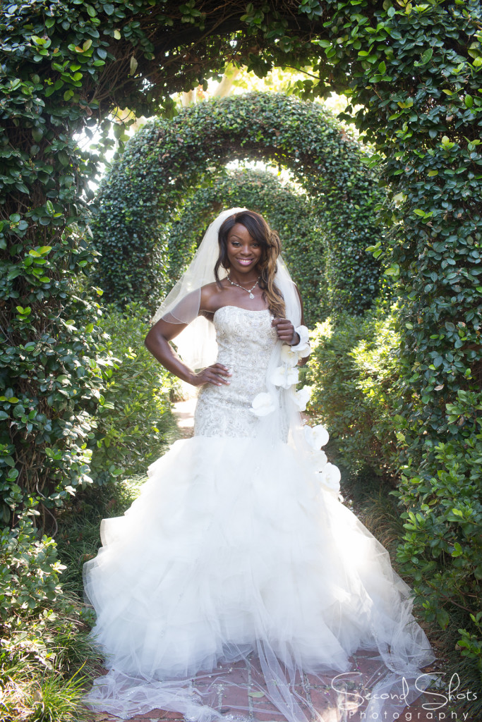
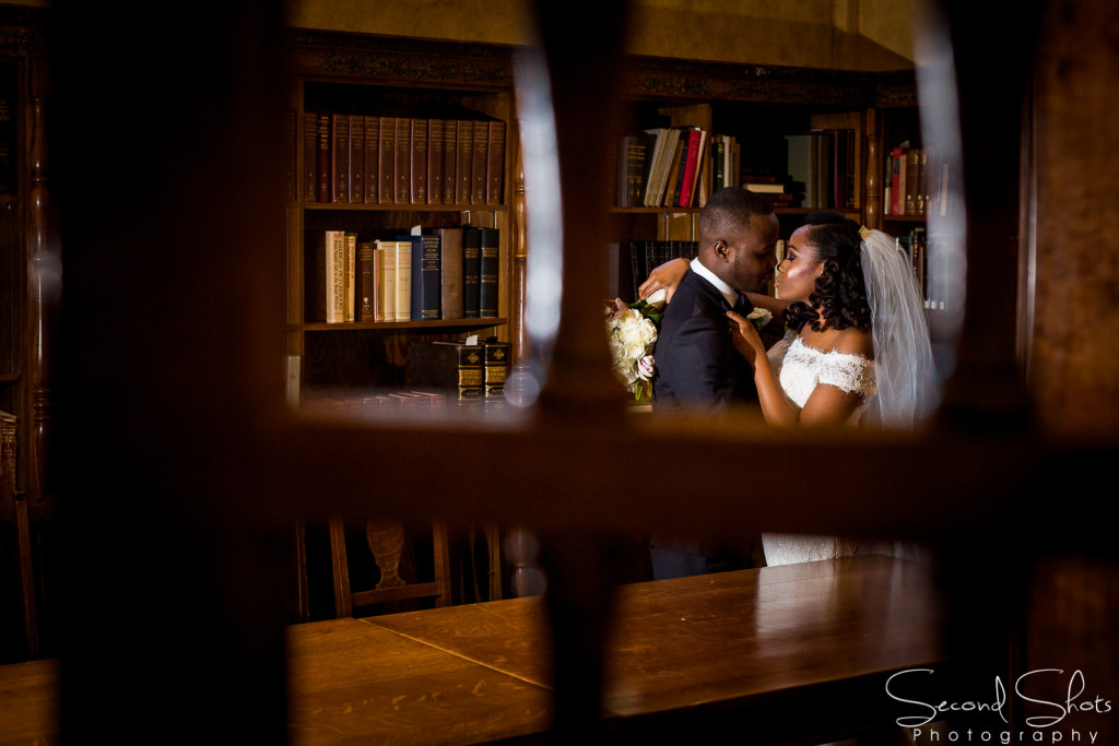
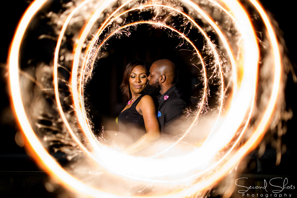
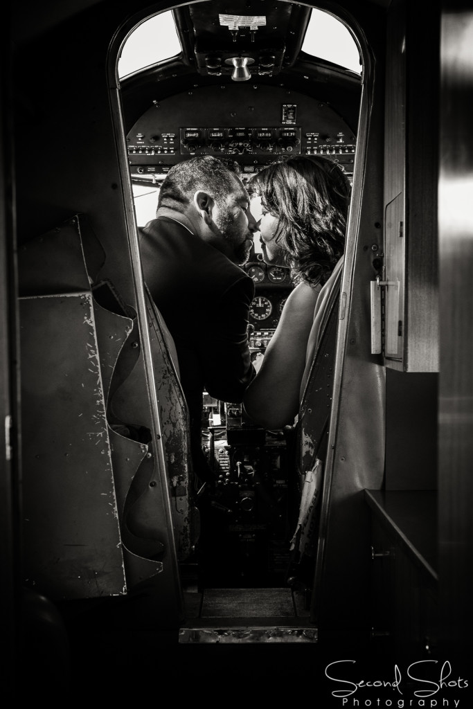
FRAMES WITHIN THE FRAME & SHOOT THROUGH – Have I already called one of these techniques above my favorite? If so, I change my mind, this is my favorite composition of all. The world is filled with objects that make the perfect natural frames, such as trees, archways and holes. When you place these around the edges of your composition you help isolate your subject from the outside world. The result is a more focused image which naturally draws the viewer to the main point of interest.
Each of these rules of composition are great alone, when you find ways to marry three or four of these together you start to create work that is truly dynamic. There are more rules of composition that I did not mention like: reflections, cropping, simplistic background, view point, bird’s eye, point of view, and many more because I do not find them as intriguing as the aforementioned. The key to great composition is that it does not seemed forced and it helps lead the viewer, tell a story or maximize the subject’s impact on the image. Thank you for reading, Ed.








Be the first to comment